Screen Siz.es
A nifty little database of, well, screen sizes.
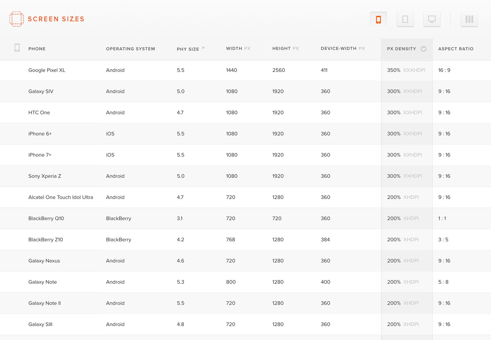
As we’ve been tackling a growing number of responsive cross-device projects, we were struggled to find a single, comprehensive database of screen specifications for popular devices.
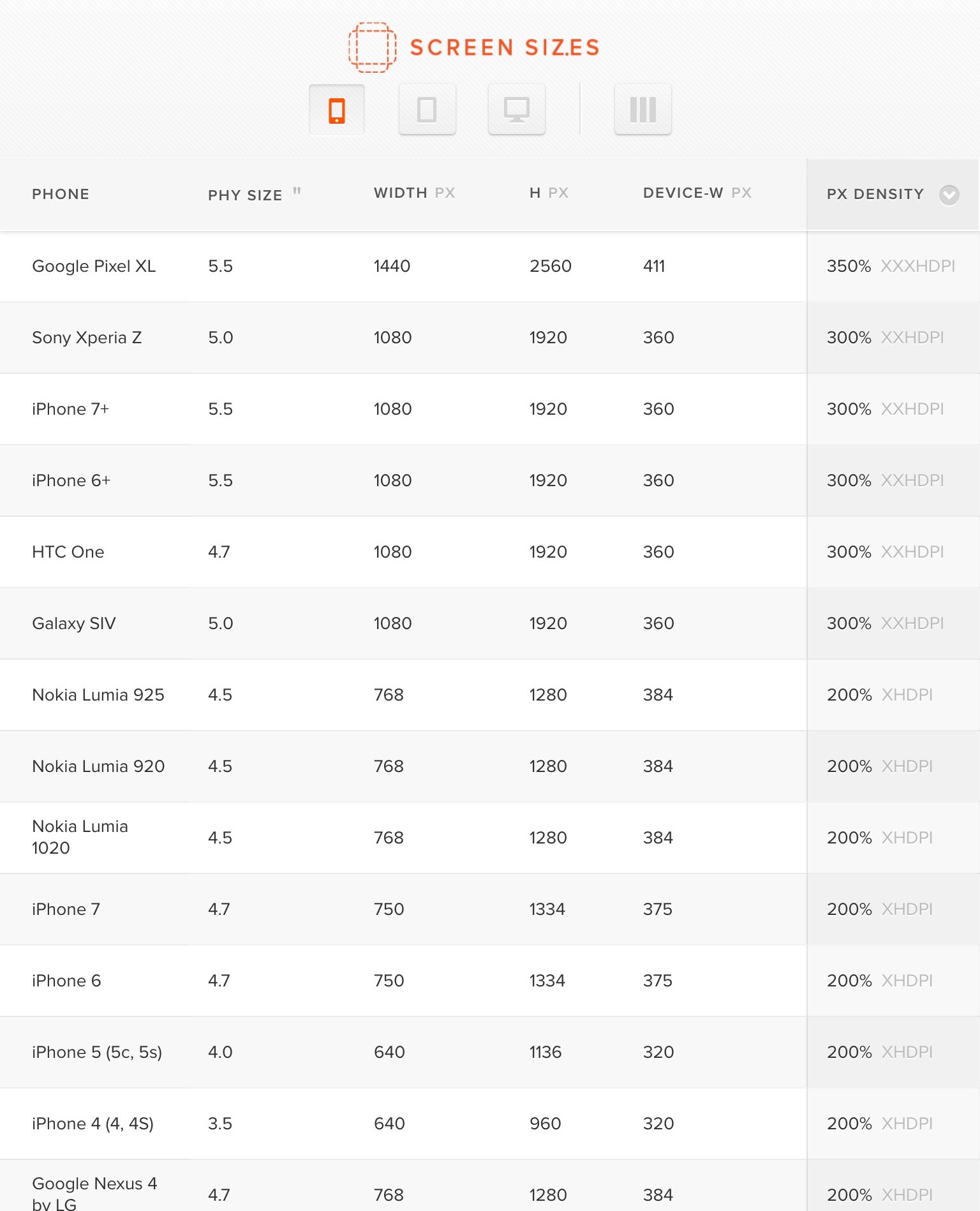
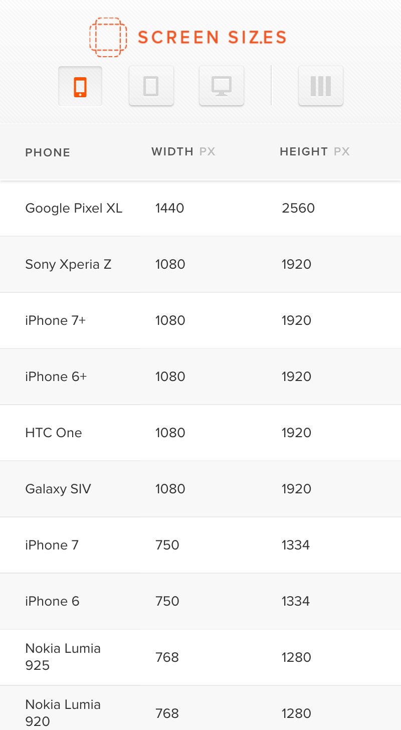
So we built screensiz.es, a nifty little database of, well, screen sizes. You can sort by several device specifications, including pixel dimensions, physical size, pixel density, and even “Popularity” (we’re using average monthly Google queries, and some fuzzy math... it’s not scientific, but it’s better than nothing).
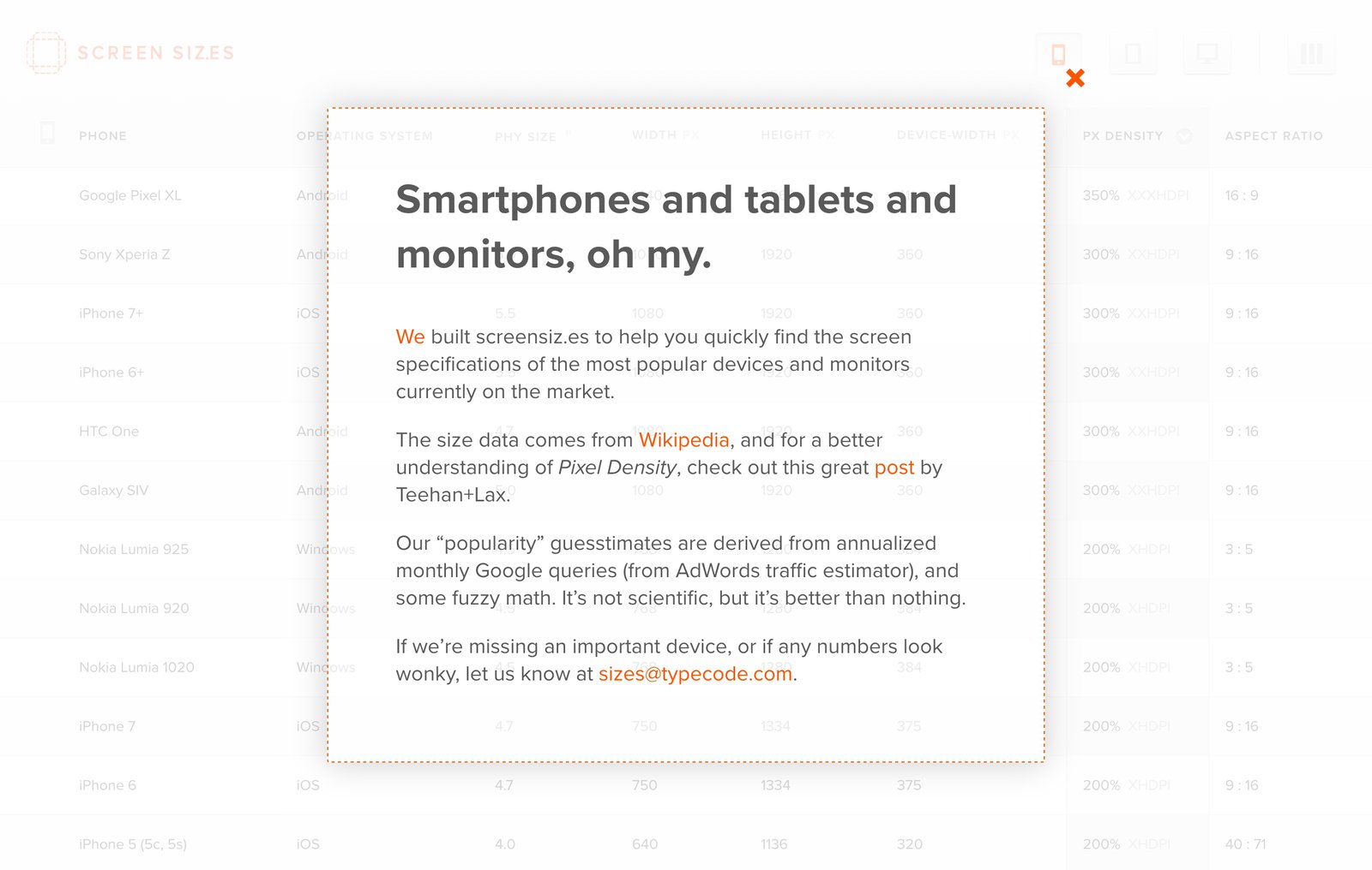
While we initially built this tool for ourselves, we decide to make this resource freely available to the design and development community. Hopefully, this helps reveal what design and development decisions will have the biggest impact on a project’s audience, and with tens of thousands of regular visitors, it seems to have struck a chord.
Recognition
- “Allowing responsive-design obsessed developers to zero in on exactly what they need” – The Next Web
- “Anyone who has ever designed for mobile will love screensiz.es” – Swissmiss
- “Screensiz.es makes locating valuable data dead simple” – FastCo Labs
Hops Chart →
ItsAlmo.st