Scholastic + HMH Co. Read 180 Universal
Designing a multimedia learning platform to support struggling students.
The power of adaptive technology can help even the most reluctant reader become successful.— Dr. Hasselbring, Research Professor, Dept. of Special Education at Peabody College
When Scholastic launched the first iteration of Read 180 in the late 1990s, they unlocked a wealth of opportunity for how technology could be leveraged within intervention programs for struggling readers. Built upon Dr. Ted Hasselbring’s groundbreaking research into the intersection of education, cognition, and technology, Read 180 was the first software that used student performance data to dynamically customize the path of reading instruction. As Read 180 evolved over the following 15 years, it maintained its position as the most effective system for fourth to 12th graders readers at least two years below grade level, and has become embedded into school systems across the country. When Houghton Mifflin Harcourt acquired the Read 180 platform in 2015, a major revamp of the software, Read 180 Universal, was well underway.
HMH approached Type/Code to collaborate with their experience design team, and lead the interface design process. Building upon an existing successful foundation, this next iteration would leverage newly available interface design opportunities to improve the student experience and program effectiveness.
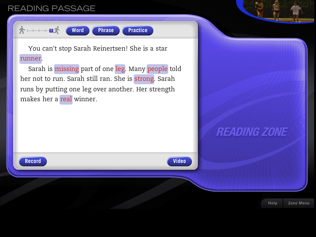
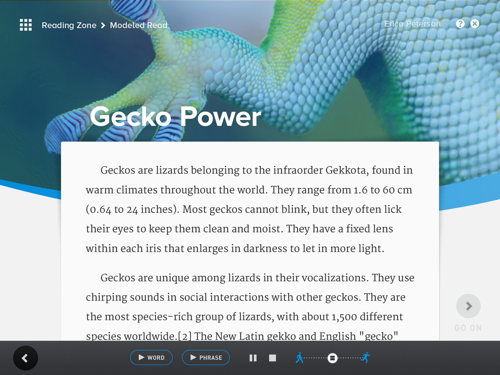 The Reading Zone today.
A design thesis centered on respect and aspiration
In researching previous iterations of Read 180’s platform and other educational software, a recurring theme began to emerge — language and visual systems often erred juvenile, simplistic, or patronizing — despite the software’s span across age groups. With a user base of struggling readers between ages 9 and 18, whatever changes were made would need to accommodate a significant range in cognitive maturity. Our design approach needed to be engaging, accessible, and even fun–and didn’t need to “design down” to a lowest common denominator.
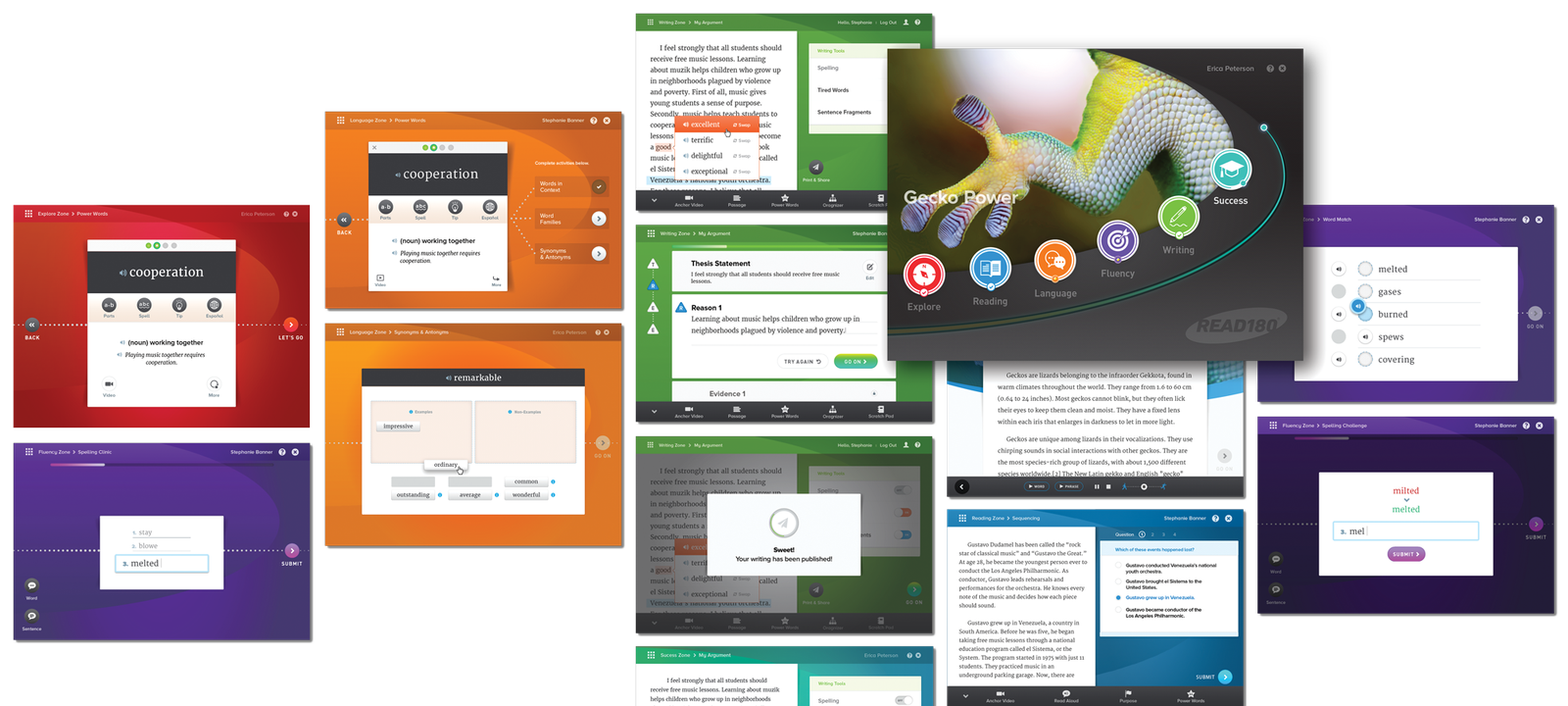
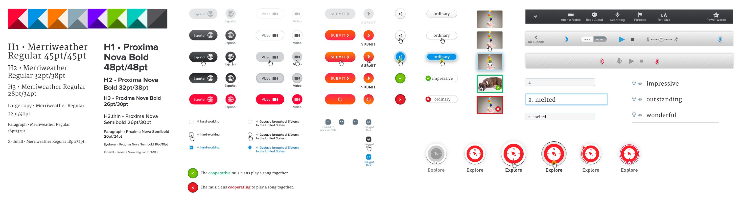
Read 180 had long been using a bold color palette to differentiate contextually six “zones” of progress as students move through the program (corresponding with printed companion workbooks). To retain existing brand cohesion, we adjusted hues and color treatments subtly, elevating the visual tone of the application while maintaining the contextual functionality that the zone colors provided. As our interface design took form, we established a comprehensive component style guide that could grow and adapt across a vast range of use interactions, and behave responsively within Read 180’s now web-based contexts, ranging from tablets to Chromebooks.
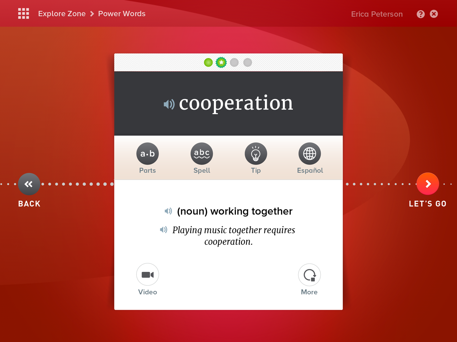 A word card in the Explore Zone.
Key Elements
Pronounced usability affordances such as large hit points, high contrast, and context-reinforcing animations and transitions, allowed Read 180’s visual system to be slightly more sophisticated, becoming accessibly aspirational for a 4th grader without alienating a 12th grader.Narrative UI
The metaphor of “the path”, reinforced by the dotted line transition armature, became an important tool for the software; students used this to orient themselves within their zones and exercises.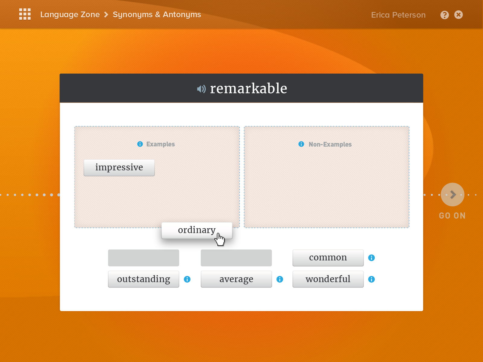
Tactility
Our visual interface system employed restrained tactility to ensure interactive elements were clear to users with limited computer experience, without swinging excessively skeuomorphic.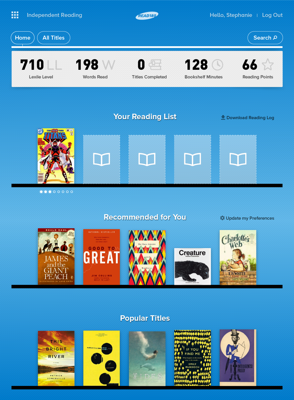
Creating a journey
For the Read 180 program to be effective, it requires many months of dedicated (and often repetitive) engagement. Rather than assume the false facade of the experience being a game, our creative direction focused on turning the experience into a journey. With students typically wanting to succeed, continually reinforcing one’s constant progress became our driving mechanic.
Visualizing the progress students make throughout their journey started with establishing a series of spatial metaphors that live along a path. From the initial “zone menu” we illustrated the progress a student has made within each zone, as well as the student’s progress along the entire program path.
As students progress through the application, they follow a horizontal dotted line as the interface transitions from left to right between exercises, subtly reinforcing continued progress along their path.
Moving beyond the screen
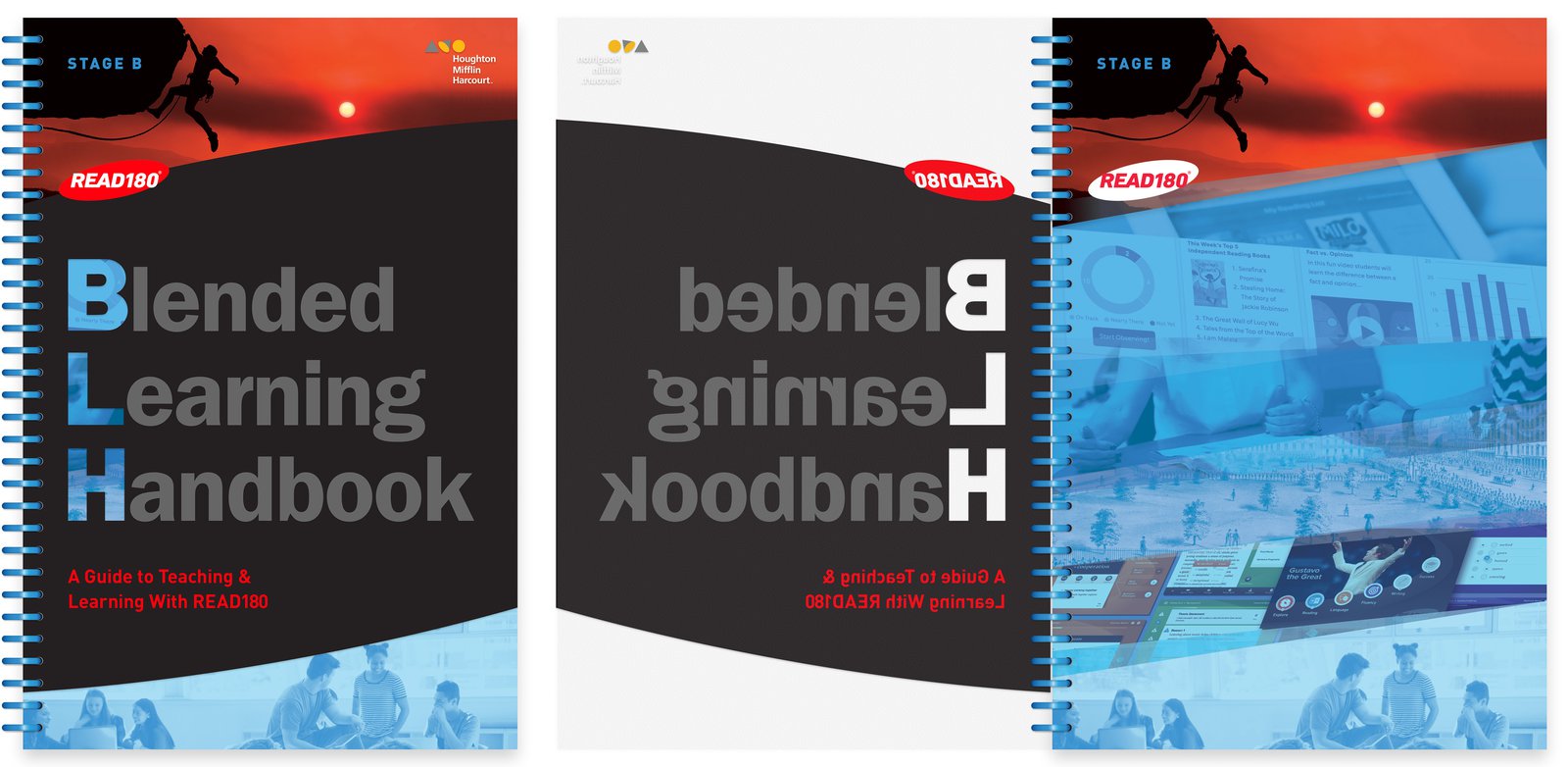
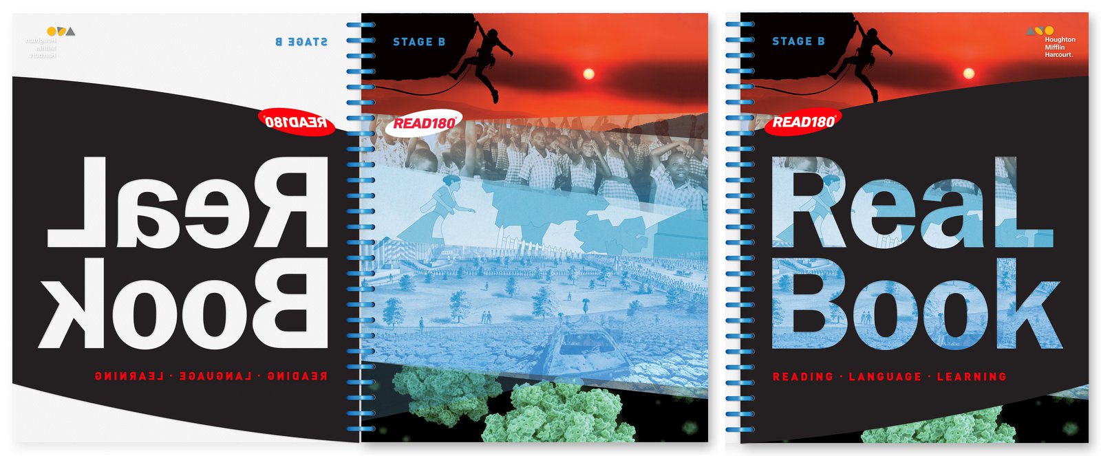
Read 180 uses a unique blended learning approach that combines application-based exercises with physical student workbooks and teacher resources. Type/Code designed three levels of student workbooks, and their instructor workbook counterparts, in harmony with other printed materials that the Read 180 programs leverages. Typography from the software was used for the book, ensuring that all stages of the blended learning program felt cohesive.
Type/Code brought elegance and edginess to design, and creativity and nerdiness to development. They were great communicators, fun collaborators, and organized planners. Endorsing them is a no-brainer every time I do it — and I always do it. Like now. I’m doing it.— Alex Sherwin, Creative Director at HMH
Effectively impacting students
Since launching the new iteration of Read 180 Universal, the platform has been enthusiastically embraced in all 50 states and in over 40,000 classrooms. There are over one million active students’ licenses currently being used every day.
GOOD →
Stowaway Cosmetics